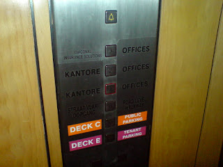
I don't know if it is age, but it is as if more and more little things are starting to irritate me. It is not as if I cannot live with these things, it is just that I would really like these things to be different. Take lifts for instance. Why is it that most people cannot understand the buttons for a lift? When requesting a lift one is confronted with two buttons: an UP arrow and a DOWN arrow. This should be absolutely clear: When you want to go UP, you press the UP arrow, and so forth. Then why is it that the majority of people press both? This slows the whole operation down and we have to spend much more time in lifts than is necessary.
I think it is because people think that they have to "call" the lift to come to them, and because they don't know if the lift is above or below, they have to press both to either "call" the lift to come UP or to come DOWN. Maybe we should add "Lift Operation" as a mandatory subject in school.

No comments:
Post a Comment